This logo is designed for 56SPACES’ itself. The design is inspired by architectural plan lines and axes. Graphically the number 56 is hidden in the background which is a design idea comes from the gestalt principles. The logo has four main masses which represent architecture, photography, graphical design and human interaction.
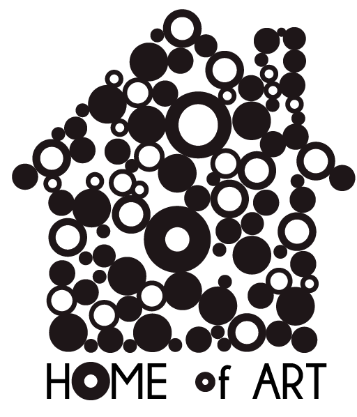
‘HOME OF ART” is an art gallery on a top location in the Museum district -just across the Concertgebouw- of Amsterdam and only open for two months as a pop up. It has a broad collection of different forms of art such as glass work, paintings, pottery, ceramics and decorative house materials like glass sinks, carpets, hand painted plates from different artists who come from all over Europe. The idea of pop up and having so many artists in the same gallery inspired us to use many circles in a house outline.
![]()
THE LEARNING LAB is a think tank for learning and social innovation. The logo consists of both “L’s” of “Learning” and “Laboratory”. In the logo we mirrored the “Lab’s L” to make the L of “Learning”. We decided to make the “Lab’s L”bigger than the L of “Learning” because laboratory takes an important role in learning. We used filleted forms and a modern san serif font to make the identity young and innovative.
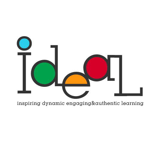
IDEAL is a collective of educational innovators who practice and share ways to inspire and engage their students and communities. The name is coming from the initials of “inspiring, dynamic, engaging, authentic learning”. The logo is inspired by the way they practice, which is not linear and very playful. We have four colors in the logo to represent the seasons because of their seasonal meetings.
to see: POSTER‘s by 56SPACES